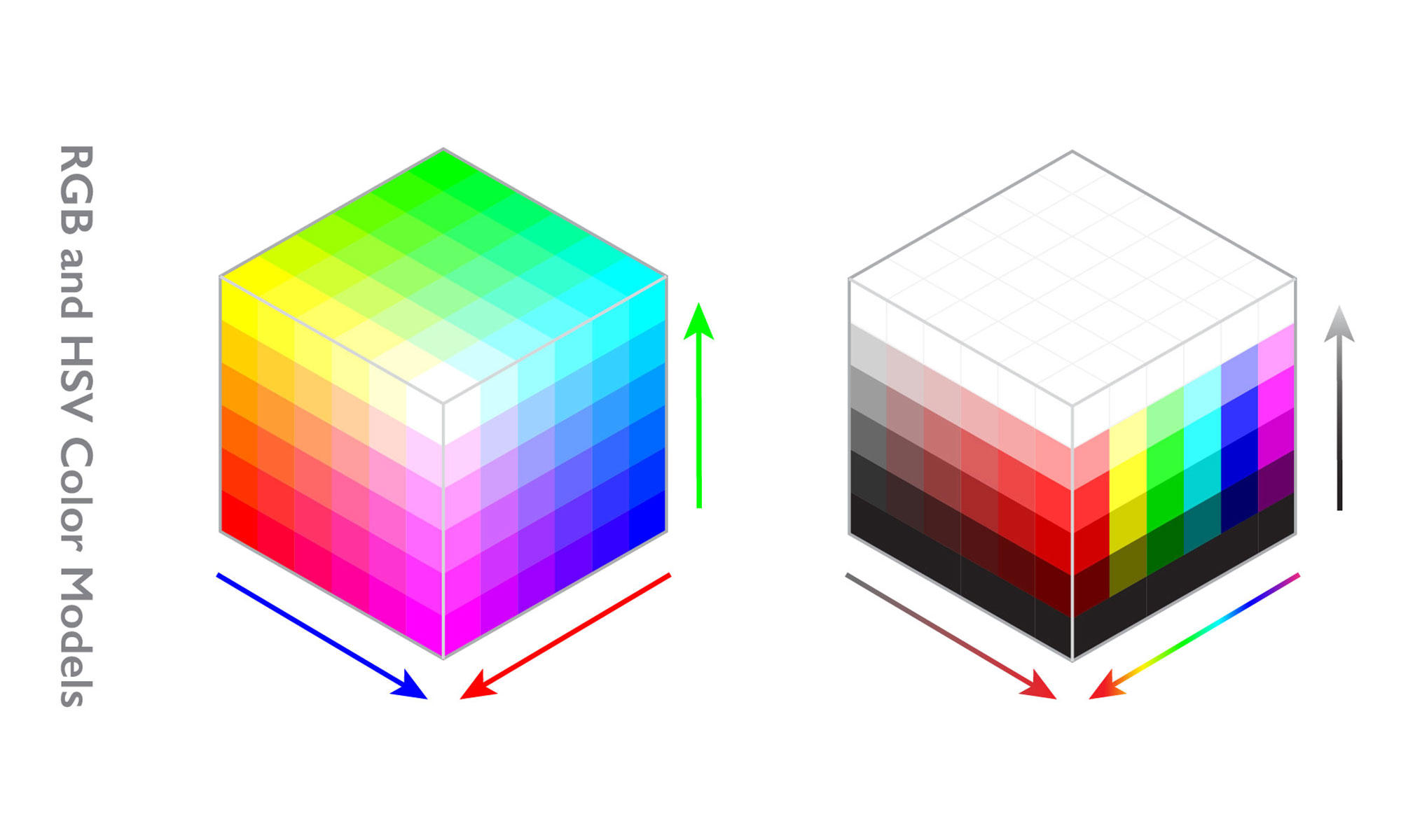
Have you ever wondered why the vibrant colors on your computer screen don’t always translate perfectly to printed materials? This discrepancy often stems from the different color models used for digital displays and print. While we see a dazzling array of colors on our digital devices, printed designs rely on a more limited but precise system to capture the essence of color on paper. This begs the question: which color model reigns supreme in the realm of print?

Image: dianawitcher.com
Understanding the intricacies of color models is crucial for designers, photographers, and anyone involved in the printing process. It directly impacts the accuracy and quality of the final print, ensuring that the colors you envision on your screen faithfully come to life on paper. So, let’s dive into the world of color models and discover the key player behind the vibrant hues we encounter in print.
CMYK: The Color Model of Print
In the vast landscape of color models, one stands tall as the reigning champion of print: CMYK, which stands for Cyan, Magenta, Yellow, and Key (Black). This model, also known as subtractive color, forms the backbone of the printing industry, enabling us to transform digital designs into tangible masterpieces.
How CMYK Works
CMYK is a subtractive color model, meaning that it starts with white light and then subtracts colors to create the desired hues. Imagine a white sheet of paper, a blank canvas waiting to be painted.
- Applying cyan ink subtracts red from white light, leaving behind a greenish-blue color.
- Magenta ink subtracts green, resulting in a reddish-purple hue.
- Yellow ink subtracts blue, leaving behind a vibrant yellow.
- Black ink, referred to as “Key,” is added to deepen the colors and create rich black tones.
When these inks are combined in various proportions, they create a vast spectrum of colors on the printed page. The precise mixture of inks determines the final color, allowing for remarkable shades to be produced, from deep blues and vibrant greens to delicate pastels.
CMYK vs. RGB: A Digital Divide
While CMYK commands the print world, the digital realm embraces a different color model: RGB, standing for Red, Green, and Blue. This additive color model is the mainstay of computer screens, televisions, and other electronic displays.

Image: www.pinterest.co.uk
RGB: Additive Color
RGB works by adding light to create color. When all three primary colors (red, green, and blue) are combined at their maximum intensity, they produce white light. Decreasing the intensity of each color creates a range of colors, just as adding more water to a pitcher of blue paint dilutes the blue hue.
The key distinction between RGB and CMYK lies in their color gamuts – the range of colors each model can reproduce. RGB enjoys a wider color gamut, which translates into a broader spectrum of colors on digital screens. However, this wider gamut doesn’t necessarily translate to print.
Why RGB Doesn’t Work for Printing
When you design in RGB and send your files to print, you might find that the colors don’t match precisely. This is because printers operate on the CMYK color model, which has a narrower color gamut. Some colors that appear vibrant on your screen may appear duller or more muted when printed.
Think of it like trying to paint with a limited palette of colors. You can achieve a wide range of shades, but you’ll be restricted by the available pigments. Similarly, using RGB for printing can lead to color discrepancies because printers aren’t designed to reproduce the full spectrum of digital colors.
Color Management: Bridging the Gap
Fortunately, there’s a solution to the digital-to-print color conversion conundrum: color management. This essential process ensures that your digital designs translate accurately to printed materials. It involves setting up color profiles for each device (your computer screen, printer, etc.) and converting colors from one model to the other, minimizing color discrepancies.
Through color management, designers can achieve consistent and accurate colors across all media, from digital displays to printed forms.
The Evolution of Color Models
The world of color models is constantly evolving, with new technologies and printing processes emerging. The rise of digital printing has led to more color-accurate printing options, pushing the boundaries of CMYK’s color gamut.
Moreover, newer printing processes, such as high-definition inkjet printing, utilize a wider range of colors, exceeding the limitations of traditional CMYK. These advancements are paving the way for more vibrant and realistic prints, mirroring the richness of digital displays.
Future Trends in Color Management
As the digital landscape continues to expand and technology advances, it’s likely that color management will become more sophisticated and user-friendly. Software applications are increasingly incorporating features that simplify color conversion and ensure accurate color representation across multiple devices and media.
Research and innovation are also exploring alternative color models and printing processes, unlocking new possibilities for color reproduction. These advancements hold the promise of a future where the color gap between digital and print is virtually nonexistent, allowing designers and photographers to unleash their creative visions with unparalleled color accuracy.
Which Color Model Is Used In Printed Designs
Conclusion
In the world of printed designs, CMYK reigns supreme. Understanding this color model is essential for anyone involved in the printing process, as it directly impacts the final product’s color accuracy. While digital displays utilize the RGB model, color management techniques can bridge the gap, ensuring a seamless transition from screen to print. As technology continues to evolve, we can expect even greater color precision and bolder color possibilities in the printed landscape.
So next time you admire a beautifully printed photograph or a stunning brochure, take a moment to appreciate the science behind the colors. It’s a testament to the power of color models and the remarkable advancements in the printing industry that bring vibrant hues to life on paper.


